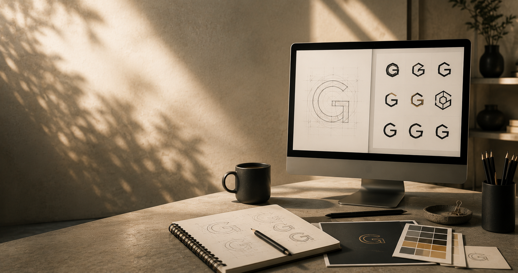
The more interesting question isn’t whether AI can design a logo. It’s whether it can design the right one.
If somebody had asked this question only a few years ago, the answer would have been straightforward. Artificial intelligence simply wasn’t capable of producing anything that could genuinely be described as thoughtful logo design. It could analyse images, recognise patterns and automate repetitive tasks, but creativity still felt reassuringly human. Designers might have disagreed on style, technique or taste, yet there was little doubt about who sat at the drawing board. Today, the conversation feels very different.
AI can now generate hundreds of logo concepts before you’ve even had time to finish your morning coffee. Some are predictable, others surprisingly sophisticated, and a handful are genuinely difficult to distinguish from work produced by an experienced designer. It is no longer unusual for a business owner to type a short prompt into an AI tool and receive a collection of polished identities within seconds, each one complete with colours, typography and mock-ups showing how the logo might appear on signage, packaging or stationery.
It’s an extraordinary technological achievement. It has also prompted a perfectly reasonable question: if software can create something that looks this good, why would anyone still commission a professional designer? Like many good questions, however, it contains an assumption that deserves a little closer examination. It assumes that the purpose of a logo is simply to exist. To occupy the top corner of a website, the front of a business card or the side of a delivery van. In reality, a logo has never been valuable because of how it looks. Its value lies in what it represents, and that is where the conversation becomes far more interesting than AI versus humans.
Perhaps, then, we’ve been asking the wrong question all along.
Looking Right and Being Right
There has never been a better time to create something that looks convincing. Not just in design, but across almost every creative discipline. AI can produce photographs of places that have never existed, compose music in the style of long-dead composers and write prose that is increasingly difficult to distinguish from human authorship. In many respects, the technology has become astonishingly good at understanding what things are supposed to look like. Logo design is no exception.
Ask an AI to create an identity for an artisan bakery in the Cotswolds and you’ll probably receive elegant serif typography, warm earthy colours and a tasteful illustration of wheat or a rolling pin. Ask for a modern technology company and the palette will shift towards cooler blues, geometric shapes and minimalist lettering. The visual language is often remarkably convincing because AI has absorbed millions of examples from which to recognise patterns.
That ability, however, can sometimes create an illusion. It encourages us to believe that because something looks professional, it must therefore have been designed with purpose. The two are not always the same.
Imagine walking through the set of a beautifully constructed film. From the camera’s perspective it appears to be a complete Victorian street, lined with convincing shopfronts and elegant townhouses. Walk behind the façades, however, and you may discover little more than timber frames holding everything upright. The appearance is authentic because that’s all the audience needs to see. A logo can work in much the same way.
It may possess balance, proportion and attractive typography, yet still lack the deeper thinking that gives an identity longevity. It may look exactly as a successful logo should look without ever asking the questions that successful brands are built upon. That isn’t a weakness of artificial intelligence. It is simply a reflection of what it has been designed to do. AI predicts, design investigates, those two things often overlap, but they are not identical.
A Logo Has Never Been the Brand
One of the reasons this debate has become so polarised is that we continue to use the words logo and brand as though they describe the same thing. They don’t. A logo is a symbol, a brand is an experience. The distinction matters because experiences cannot be designed in isolation. They are built gradually through every interaction someone has with a business: the first impression created by a website, the tone of an email, the confidence inspired by customer service, the quality of a product, the recommendation from a friend and the memory that remains long after the purchase has been made.
Over time, all of those moments become attached to a simple visual mark. That is why the world’s most recognisable logos are, almost without exception, surprisingly uncomplicated. The Nike swoosh is little more than a sweeping curve. Apple’s famous icon is simply the silhouette of a piece of fruit with a bite removed. McDonald’s golden arches could hardly be more straightforward. None of those marks became iconic because they were complex illustrations. They became iconic because decades of consistent experiences gave them meaning. In other words, the logo was never doing the heavy lifting on its own.
A useful way to think about it is this: if branding were a novel, the logo would be the cover. A beautifully designed cover may persuade someone to pick up the book, but it isn’t the story itself. The value lies in everything contained within its pages.
Where the Real Work Begins
This is perhaps the part of the design process that is least visible to anyone outside the profession. When most people imagine logo design, they picture sketches, mood boards and colour palettes spread across a desk. They imagine the creative moment when ideas begin to appear on paper. In reality, that stage often comes much later.
Long before a single shape is drawn, designers are usually trying to understand something far less tangible. They are trying to understand people, who is this business trying to reach? why do customers choose it instead of somebody else?,
what assumptions already exist within the market? Is the business trying to challenge convention or reassure people with familiarity? Should it feel established and authoritative, or energetic and disruptive? Is it competing on craftsmanship, value, innovation or trust?
These are not artistic questions, they are strategic ones. Only once those conversations have taken place does drawing become worthwhile, because the sketches are no longer guesses. They become responses to clearly understood problems.
This is where AI currently approaches the task from a different direction. Unless prompted with that strategic thinking, it begins with visual interpretation rather than investigation. It can produce extraordinary variations of an idea, but it relies on somebody else to define what the idea should be in the first place. That distinction is easy to overlook because the finished images often look so accomplished. Yet it remains one of the most important differences between generating artwork and developing an identity.
In Part Two, we move from philosophy to practicality. We’ll explore where AI genuinely excels, where it still falls short, and some of the less obvious considerations surrounding ownership, originality and the technical realities of using an AI-generated logo in the real world. This will be published 7th August