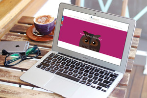
Foresight Health and Safety are a local start up who came to us asking to brand them. We wanted to remove them from the stereotypical image of Health and safety being dull, so we went for a friendly vibrant colour scheme moving away from the typical corporate pallet that so often associated with the sector. To further add to the approachability we created the logo using an owl, synonymous with wisdom and incredible eyesight it fitted the bill perfectly. From here we developed a range of four owls which carry messages across the sites header.
The site also contains custom icons which can be used to navigate and add splashes of colour throughout the site.


